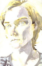
Elenore Toczynski (http://ghostlytoast.blogspot.com/) (above pic ©E. Toczynski)
"Brain Crease" #1 an eerie and evocative story about a boy who is abducted to make dreams. tense linework, character design quoting Vasquez or Dirge. I want to read more! I was especially compelled by the subject matter and all the paintings of hallways. In addition to this, Elenore was extremely sweet and funny and pretty and generally fun to be around. Interesting to see this darker, more contemplative side of her personality. I guess Brain Crease #2 just came out: i must aquire that.
Dylan Williams of Sparkplug (http://www.sparkplugcomicbooks.com/)
"Reporter" #6 two 1950's newspaper reporters argue with people at a work party. Strong graphic presence, convoluted and sometimes insightful debate, interesting almost-noir vibe. Remember how you go to parties, and someone says something dumb, but when you try to correct them you sound also dumb and they don't listen? This story will be extremely satisfying to people who experience that a lot.

Joey Alison Sayers (http://www.jsayers.com) (above pic ©J. Sayers)
"Just So You Know" #1 a sweet and funny account of the author's gender transition. I like reading about gender shifts, in part because i don't feel strongly part of any gender, and in part because i do feel strongly between things, chimeric, and metamorphosis is really appealing to me. Joey Sayers' style features cute simple drawings, full of hope and grace. Joey shared a table with Elenore, and together they were a beautiful and hilarious tableparty.
-this just in- Joey Sayers has an awesome and hilarious strip called "Thingpart." You want to read it for days. It is here: http://www.jsayers.com/thingpart/thingpart.html

