Friday, July 16, 2010

Booksa


Working at Borders:
Books books books books books books books
books books books books books

Thursday, July 15, 2010

Cat problems

You know what helps you get better at something? Doing it a bunch. I was inspired by Elle Skinner's biographical comix (http://elle.mysky.net) and, of course, DAR and American Elf and... but Elle Skinner was the final straw. So i'mma do two strips a week about stuff that happens to me. It's like push-ups for your pacing and composition muscles. I'm aiming to spend about 30 min. on each strip, so enjoy the art. Also, to avoid inappropriately personal content, each strip will be based on a haiku. If you can make a haiku out of it, it's not inappropriate.

Plaintive cries- I was socializing kittens. My cat pooped in the sink.

Saturday, January 23, 2010

Comix Panels: 5 Rows is Too Many!

I was working on Circus Season, and i learned a valuable lesson about pacing.

First, some background. Circus Season was supposed to be a little quick over-the-summer project. A group of us, Lauren Andrews, Jamaica Dyer, Aidan Casserly and myself among them, agreed to do a little comic on the theme "burlesque apocalypse" and then release them all together as a zine. I don't know what became of anyone else's project, but me, i did 6 pages and then didn't touch it for 2 years. I wanted to come back and finish it, both because i thought it would be a relatively quick way to get good comix experience and because i just need to finish things, goddammit. So now i'm doing 3 pages a week and i'm learning a lot. Nothing like doing something to help you learn how to do something.

For instance, i learned that you don't really want more than 3 rows of panels in a single page, unless you're using Infinite Canvas or you've got a really good reason. As the plot thickened, i noticed that i was putting more rows of panels in each page to speed up the action and create tension. By page 13 it was really getting out of hand. Here's my initial page layout:


It doesn't read clearly, it's hard to see what's happening in those little tiny drawings, and the eye just skims over sections. Instead of creating fast, tense action, it creates confusing opacity. I thought i could just ignore it and vow never to do that again, but it bothered me more and more as i inked it. So i broke it up into two pages. Here's the final layout:


It's much easier to tell what's happening, especially in the long shots. Take two lessons from this:
1. Don't go row crazy! Think real hard about how your panels read, and whether you've given them the space they need to shine.
2. When you know something is dumb, fix it. If you spend 4 hours inking it and then finally give in and redo the page, you're out 4 hours and a good sheet of paper.

Lesson learned!

Tuesday, October 13, 2009

Saturday, September 19, 2009

Zine Party Tonight tonight!

San Jose's underground (by which i mean slightly less produced: Works Gallery had a whole zine-to-the-masses week a couple months ago, with workshops and professional mentors and greatness. Now that i'm talking about it, i'm sorry i missed it. This was just, y'know, a zineparty.) zine event went off full awesomeness ahead tonight. Some highlights (among many) were Reiko Miyagawa's tribute to Dirty Harry, kittyhotpants' hand-stitched ephemera, and Matthew Seigel's Tips for Lovers. (that guy has good advice. heh.) Some more highlights were Cat Food Millionaire, Yumi's felt zines, and the Create-Your-Own Hipster Boyfriend Chart. There's basically too much good stuff to mention right now; i would get totally bored telling you about it. If there's a complete list anywhere i'll link.

Zine Party Tonight happened at Kaleid Gallery, and was put together by Yumiko Miyagawa

Yeah! Zine Party Tonight go! Yumi wins!

Tuesday, September 15, 2009

Variety of mark making with Scratchboard


This post is not about how to do traditional scratchboard. For great scratchboard tutorials that will teach you to do the kind of photo-real linework you expect from scratchboard, check out http://www.scratchboard.org. This post is about how to use ink to achieve some more tonal, painterly, messy or expressive effects. This post is about how to weird up your scratch art.

I don't know what kind of ink you use. I use Sumi, 'cause i like the consistency and the thick satiny coverage, and, more importantly, it's what i had on my desk. What i'm about to describe would probably work with any water-soluable ink, but i know for sure it works with Sumi.

1. Line weight
Traditional scratchboard uses a sharp tool, often a stylus, to scratch lines of a consistent width into a layer of ink, revealing the clay underneath. Cool. But the stylus only gets you one width of line, yielding an etched, rapidograph look. Which is awesome if you want that, but by simply switching to a broader tool, like a #11 X-Acto blade, you can scrape away a larger area, giving you a variety of line widths from thin stylus to fat scrapey. Check it out:


Mix the fat scrapes with precise stylus values for a full range of precision and expressiveness. All your marks are pretty earthy, though, hard or gritty or scrapey. So how you gonna soften it a little?
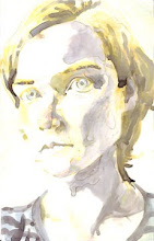
2: Wet it up.
Use a wet brush to moisten an area and brush away the topmost layer of ink. While the clayboard feels pretty smooth, it's actually full of tiny pits and peaks. The ink will rub off the peaks first, giving you a sparkly, silty, soft-edged value shape. You can move the ink you just wiped off to another area, bringing down something that's too light or softening something that's too harsh. Be warned, though, ink's not all the water dissolves. A little of the clay comes with it, and the resultant mixture is slightly paler and more matte than the raw ink areas. If you're watching for it, you can use it to lighten areas without scratching them. If you're not watching for it it'll mess with your game, make areas read wrong. In my drawing it flattened an area that should have read as dimensional, and made dimensional another area that should have lain flat. If the clay effect troubles you, just brush matte medium over the offending area- that gives you a level playing field. You can still scratch through it, although your lines will be a little grittier. Not surprisingly, you can't use water to lift ink off a matte mediumed area.


You can also use water in the ink just like you would with wet-on-wet watercolor. Aces.

Sunday, September 6, 2009

SFZinefest pt.2


L. Skinner- "Ellezilla goes to Japan!" (mysky.net)
A biocomic about Miss Skinner's visit to Japan. Funny and informative! The dialogue is extremely true to the kind of idiolect that can form between two friends, and feels very intimate and genuine. somehow, with spare illustrations and vignetted events, Miss Skinner creates a convincing sense of place.
Miss Skinner shared a table with a friend (Jeanne from the comic? the glasses were right) and they were funny and charming. They were accidentlycompletelycoincidentallyandwithoutplanning wearing the same "Harry and the Potters" shirt, which made them look like a team. Very accidentallyprofessional. Miss Skinner said she would be at ApeCon, and i will definitely look for her there, because she and her friend are really fun to be around.

Greg Means- "Papercutter issue 9" (tugboatpress.com)
A biocomic by Aron Nels Steinke about mysterious house happenings, illustrated in an appealing, roundly linear style- fun and engaging. A series of strips about a skull and a frog thing by Elijah Brubaker. A ghost story by Helen Jo. Papercutter is a way for Greg Means to showcase work by his favorite comix artists. Papercutter is great.
Clutch McNasty- "Clutch #21" (splitbook, with Invincible Summer #17)
Both halves are biocomics about people working in comics fields. Clutch works at Guapo Comics in Portland, as well as editing comics and collaborating with other writers. Neat Groeningesque linework, funny and fascinating. I was vicariously successful for the duration of this zine. Thumbs!
Ohmygosh i met the guy who edits "Papercutter." Ohmygosh!